top of page
Tanbii: EcoGame
HOW DID I...
Discover user pain points in navigation and understanding then implement solutions to increase engagement
1 of 4 projects
tanbii.com
UI/UX DESIGN INTERN
UPCOMING IMPLEMENTATION
JULY 2024
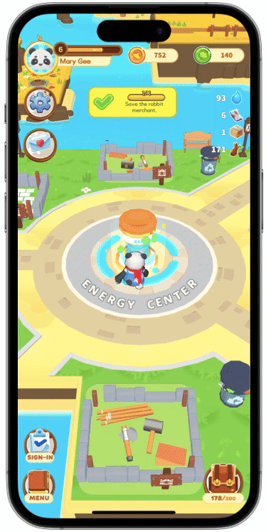
Numbers aren't the most appealing aspect of a casual game like Tanbii, so this project challenged me to ideate methods to revamp an unappealing feature to be more visually and functionally appealing, resulting in more user interaction, engagement, and retention.
week 1
Research & Analysis
I researched other carbon-tracking apps in the market and analyzed Tanbii's current carbon-tracking flow, mechanics, visual communication, and interface.
Market & User research (dashboard flow)


- Bar graphs are easy to understand and visually more appealing
- Bar graphs are commonly used to compare categories

Interrupting users with intrusive interstitials may frustrate them and erode their trust in your website.
- Google Search Central
UI analysis (dashboard flow)

User flow analysis

week 2
Synthesis & High-Fidelity
After discovering user pain points, I ideated solutions and implemented my solutions as a high-fidelity prototype by using screenshots from the app and other assets provided to us.
dashboard flow hi-fi

week 3
Polish & Revision
Carbon tracking page
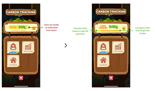
Carbon tracking dashboard

What's Next?
Our team presented our research and designs to the board of directors, and my designs are on their way to Tanbii's Design Team to be included in future updates!
bottom of page